The design duo at Kobel & Co. starts a new project by asking lots of questions.
“We spend time up front,” says Elizabeth Bennett, who co-owns the firm with Mallory Robins. Before grabbing samples, sourcing furniture or developing a strategy, Bennett and Robins want to really understand how their clients live—and how they want to live.
“How do you want this house to feel? How do you want your guests to feel? What are some of your favorite places that you have been to that you love?” Bennett asks.
Then, armed with a bounty of intimate details, they christen each of their projects with a moniker, hoping it will help capture each project’s essence and guide them along in the design process.
It’s those questions that led the team to nickname their latest renovation project, a late-1980s home in the Hallbrook development of Leawood, “Charlebarbara,” after the homeowners’ two favorite places, Charleston in South Carolina and California’s Santa Barbara.
Although on opposite coasts, these destinations both have an elegant ease, a relaxed yet civilized take on living.
“Charleston is about southern hospitality, a little more formal,” Robins says, “and Santa Barbara, also about entertainment and food, is more casual. This home is a mix.”
This was the “vibe” that Bennett and Robins, who first met in college and then reconnected several years ago through their children’s school, were looking to create for homeowners Onalisa Winblad and Curt McGeeney.
With two young children and busy careers as physicians, the couple wanted their home to be a place where they could relax and enjoy the company of family and friends.
“We come home and we feel like we are on vacation,” says McGeeney, who adds that he and Winblad could not be happier with the renovation.
The family moved into the home in 2016, and McGeeney says that while the forty-four hundred-square-foot home was functional, it was a “hodgepodge” of furniture collected over the years and set against a dated background. They wanted something that was more pulled together and truly felt like a retreat—something that reflected who they are as a family.
Designers Bennett and Robins came in and completely revamped the home’s main floor.
The Kitchen
Photography by Nate Sheets
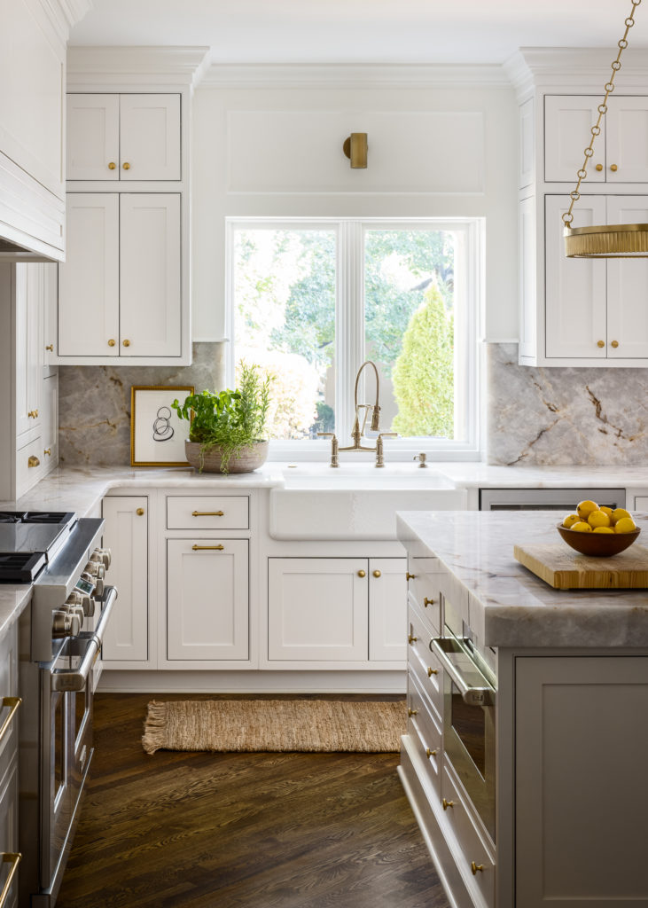
Winblad and McGeeney like to cook and entertain, so the Kobel team expanded the footprint of the original kitchen, creating a larger island where food prep and entertaining can happen simultaneously. Innovative cabinets were added to conveniently store kitchen appliances and keep other gadgets out of sight.
The kitchen’s light and airy cabinetry is grounded by the deep-brown-stained wood floors and punctuated with rubbed brass hardware and lighting fixtures. The Burchi quartzite countertops, marked with golden and dark gray veins that tie the space in with the rest of the house, were a crucial early find for the renovation, says Bennett.
The bar space mimics the kitchen tones and adds another place to entertain.
Formal Dining
 Photography by Nate Sheets
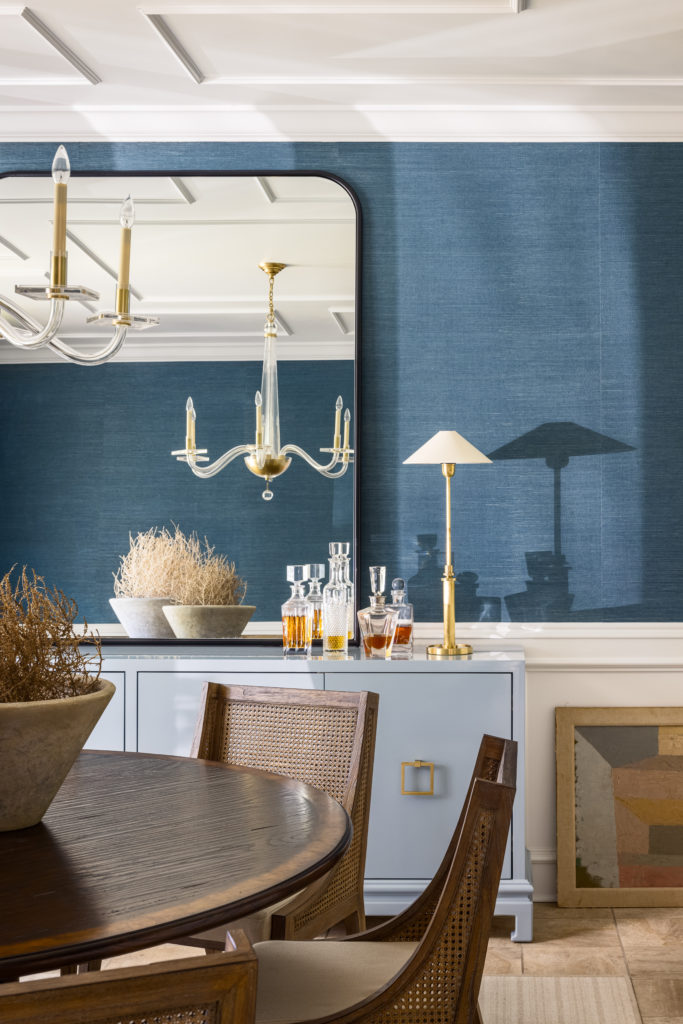
A more formal yet still fun approach was taken in the dining room. The designers infused color into the space with an ocean blue grasscloth wall covering and pale blue buffet, setting the space apart from the more neutral palette of the rest of the home.
Casual Dining
 Photography by Nate Sheets
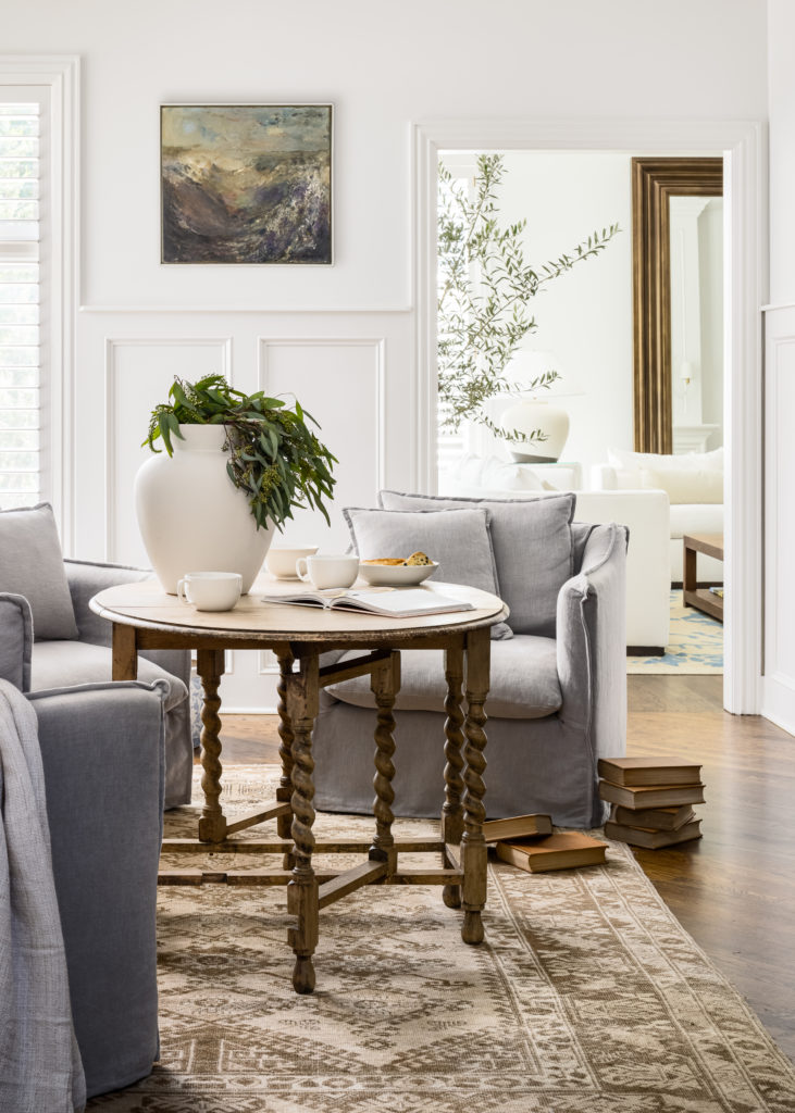
In the “hearth space” adjacent to the kitchen, the Kobel team set the scene with a vintage rug. They found an antique table just a smidge lower than a normal dining table and used modern gray linen swivel chairs for seating, creating a relaxed space to not just eat but also visit, do homework or maybe play a board game.
Art Wall
 Photography by Nate Sheets
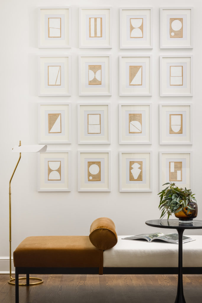
The Kobel team commissioned Josh Young, a Washington D.C.-based artist, to create a modern installation of sixteen small, neutral pieces for a specifically modern touch and to keep the space from becoming “too fussy.”
The Master Bedroom
 Photography by Nate Sheets
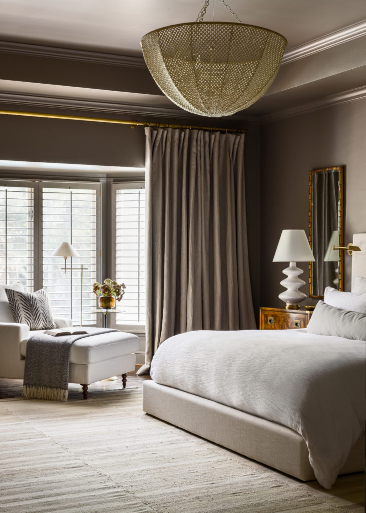
A simple monochromatic space make for peaceful nights of sleep. The room mixes more refined pieces, such as the burl wood nightstands, with organic shapes, like the large woven basket chandelier punctuating the ceiling.
Living Room
 Photography by Nate Sheets
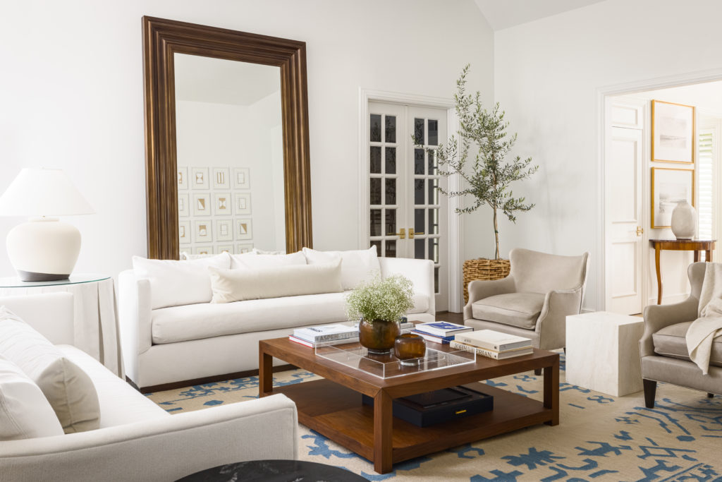
A bold blue and white flat-weave vintage rug adds color to the otherwise neutral palette in the living room. A massive mirror leans against the wall, reflecting the Josh Young art installation and adding depth to the space. The design team used performance fabrics throughout the house, including on the white sofas in the living room, to make them entertaining ready.
The post Kobel & Co. revamps a Leawood home from the late eighties while drawing inspiration from Charleston and Santa Barbara appeared first on missouridigest.com.
