When Krissie Kiehne decided to move into her father’s house with her family, she looked past the swinging saloon doors, the wood paneling in the family room and the kitchen’s buckling linoleum.
“It was in complete disrepair,” says Krissie. Her father hadn’t changed a thing to the sixties Prairie Village split-level in the twenty years that he lived there. Although he always kept a tidy yard and was more than willing to help his neighbors out with theirs when needed, interior home repair was not his thing.
But despite the home’s condition, Krissie and her husband, Matt, decided that the location was perfect for their family. Just a few blocks away from Matt’s mom’s home and near their children’s school, the large lot and beautiful mature trees made it ideal. They decided they would be able to turn the house into the perfect mid-century home for their growing family.
The Kiehnes had lived in the house for several years before actually embarking on their massive renovation project, so they knew what was working for their lifestyle and what wasn’t. However, figuring out how to turn their vision into reality was more difficult than they had imagined. As luck would have it, they met the perfect designer for their project while talking across a backyard fence. Covid had set in, and the Kiehnes were spending lots of time in the backyard of Matt’s mother’s home, getting to know her neighbor, interior designer Kara Kersten.
“Our kids spent a lot of time during Covid playing in the backyard, and we spent a lot of time just talking,” says Kersten, whose namesake design firm shepherded the project from conception to completion. “We really got to know each other well. We had a happy little bubble.”
As the Kiehnes and Kerstens got to know each other, they realized they had a similar design aesthetic. As Kersten was listening to the Kiehnes’ needs, she knew she could help.
Kersten believes in creating a home that feels “like you when you walk in the door.” It “should tap into something deep down inside that invigorates, inspires and feels the way you want to feel,” she says.
Not all of Kersten’s projects “look alike” because none of her clients are alike.
“Your home should be like a work of art or your family’s ‘fingerprint,’ so to speak—only one like it in this world,” she says.
For the Kiehnes, that meant a clean, modern space inside and out, punctuated with art and a curated selection of objects and mementos. The result is a very livable and clutter-free, “no-chaos” home.
Exterior
 Photography by Nate Sheets
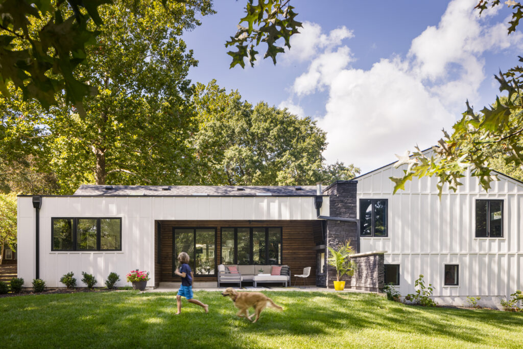
The Kiehnes’ wanted the home’s exterior to have a clean, modern aesthetic. They chose white vertical board and battan siding with horizontal stained cedar for the recessed front porch and back patio.
The original garage doors were replaced with frosted industrial-looking glass doors, allowing light to pour into the space during the day.
Making room
One of the first orders of business inside the home was to upgrade the antiquated entry. Along with replacing the original front door with a double door, Kersten did away with the walls, transforming the main floor into one large space. Now, when stepping across the threshold, the eye scans across an expansive space, landing on a back wall of windows that showcases the backyard and sophisticated patio.
To the right of the entryway is one of the Kiehnes’ first art acquisitions, a large, bright, happy painting of abstract flowers in blue hues made just for them by local artist and friend Kelly Porter.
“Our art collection is small yet growing,” Krissie says. “We decided to take our time acquiring art because we want each piece to mean something.”
Climbing Wall
 Photography by Nate Sheets
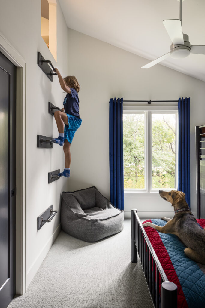
The Kiehnes wanted their children to feel that their rooms were uniquely their own. So Kersten took advantage of what would normally be a concealed attic space above the children’s Jack and Jill bathroom and created two little hideaways, accessed via ladders in their rooms.
They are quiet spaces, Kersten says, where books can be read and daydreams can be had. The secret nooks are just a few of the many spaces in the home carved specifically for family time.
Powder room
 Photography by Nate Sheets
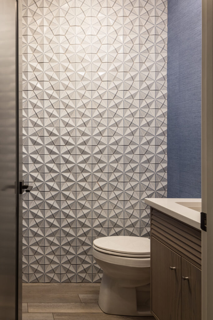
“I like a powder room that pops,” Kersten says. “It’s one of my favorite rooms to work on.” And the Kiehnes’ does just that. With one wall covered in a grayish three-dimensional tile and the rest of the room decked out in a similarly hued grasscloth wallpaper, the room is an aesthetic surprise for anyone needing to step away from the party.
Kersten’s philosophy is to always add a “little drama” to the powder room when she can. “It’s a small space, so it doesn’t overwhelm, and it’s refreshing to liven up what can otherwise be a very boring, utilitarian space.”
Because the room is usually quite small, it’s an easy place to be experimental, Kersten says. “It doesn’t cost a lot to redo if it gets tiring in a few years and you want to try something new.”
The Kitchen
 Photography by Nate Sheets
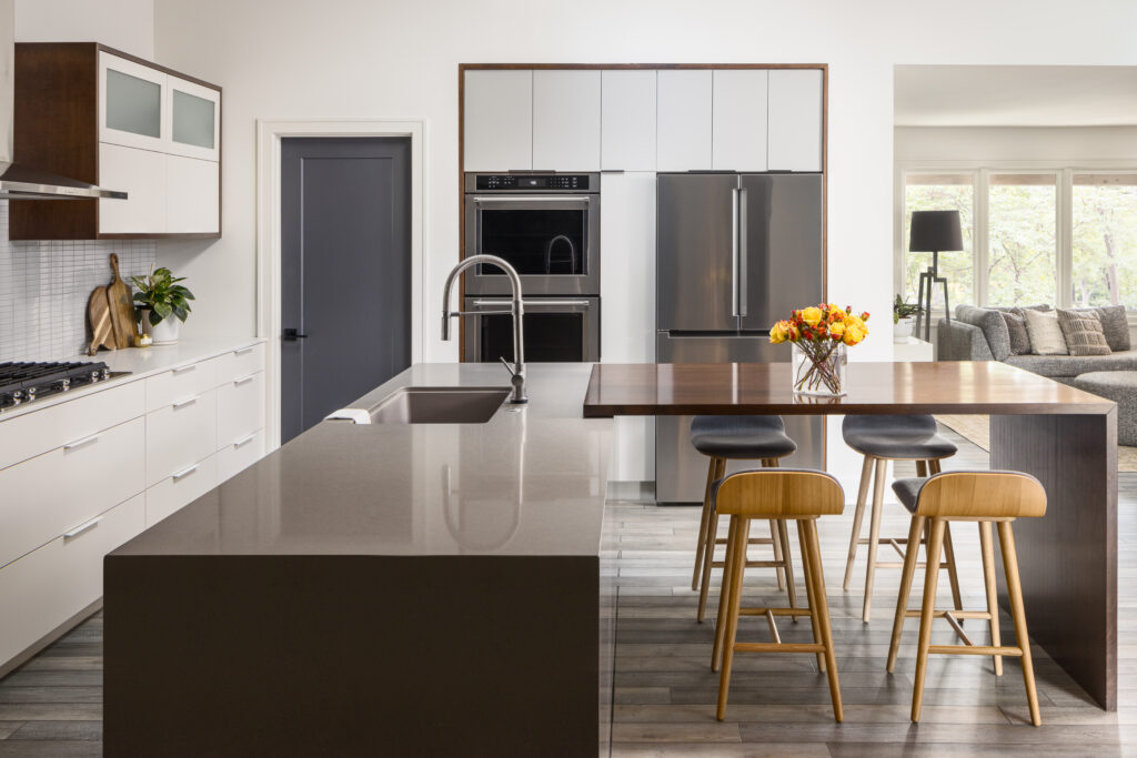
With the remodel, the Kiehnes decided to add a little square footage to their home by pushing out the kitchen’s back wall. In the extra space, they added a dining area with a view of the backyard as well as a kitchen island that runs perpendicular to a free-standing prep counter and can comfortably seat the entire Kiehnes crew for casual snacks and homework projects.
Simple cabinetry was used throughout the kitchen, allowing the space to complement the adjoining rooms rather than compete with them.
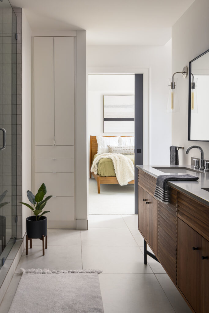
Master Bath
 Photography by Nate Sheets
Done in a serene palette of cool grays and whites, the master bath and adjoining walk-in closets seamlessly blend together. A wall of dark gray and white tile was used to create a bold, abstract, striped pattern on the far wall, turning what would ordinarily be a boring white canvas into a clever accent wall. It anchors the long linear space and is the first thing the eye gravitates toward.
The post Designer Kara Kersten helps with the stylish renovation of a hand-me-down Prairie Village split-level appeared first on missouridigest.com.
